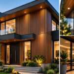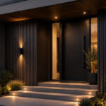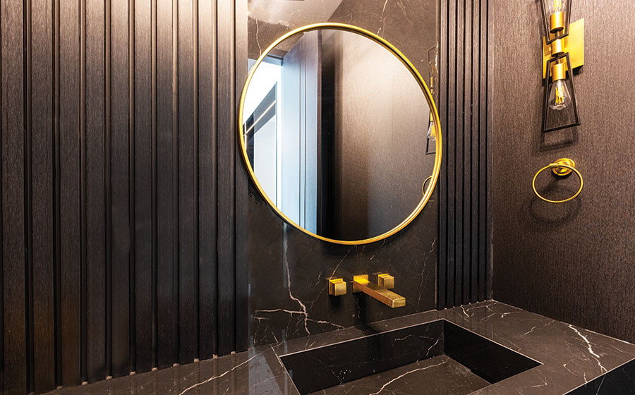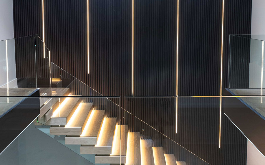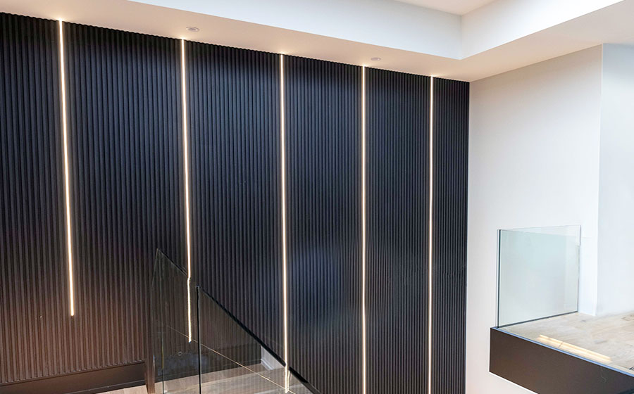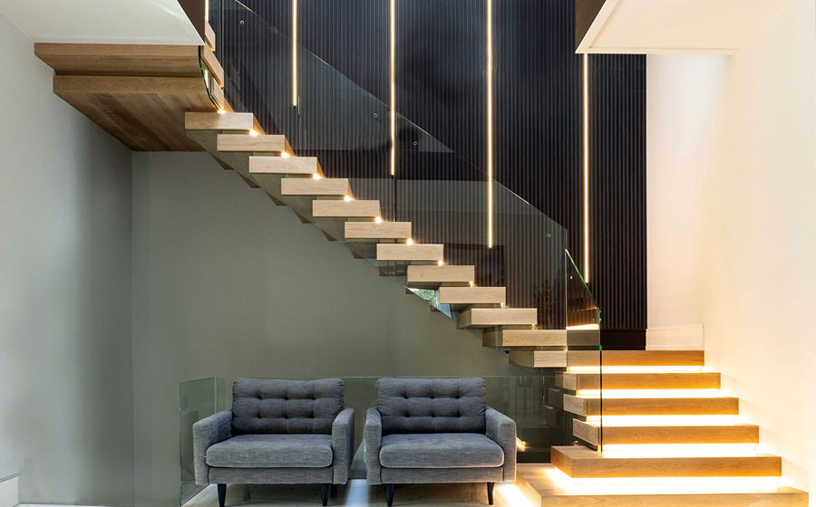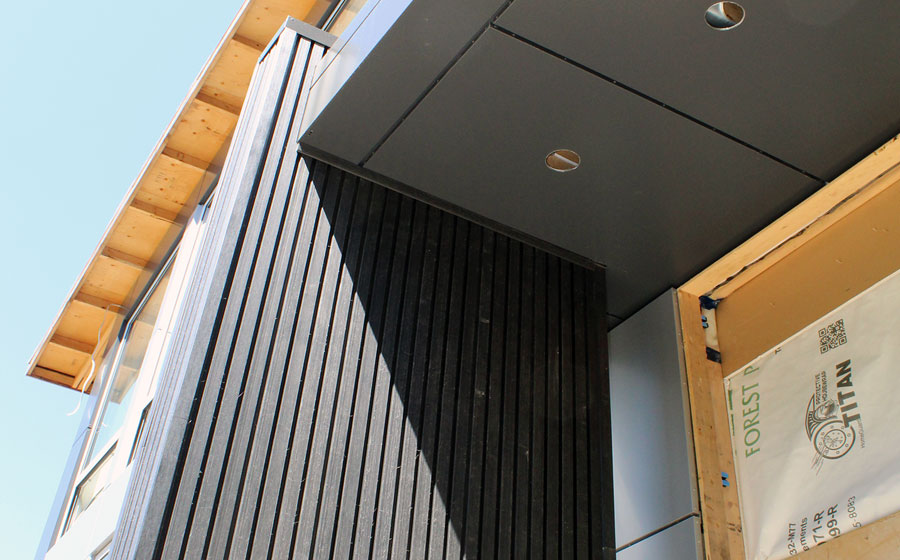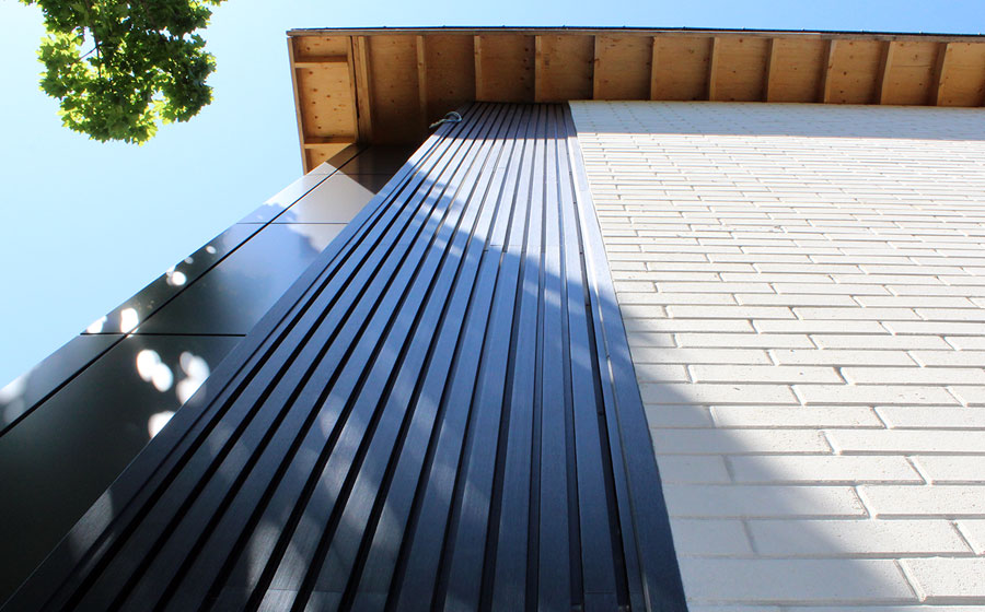
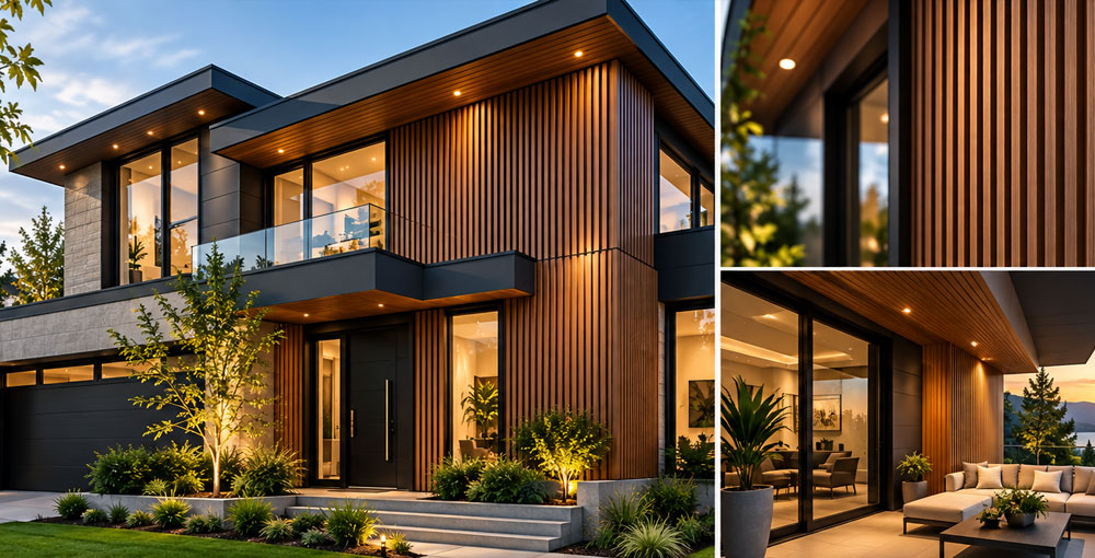
Choosing the right color for WPC wall panels can have a significant impact on the overall appearance and character of a residential or commercial project. While panel profile, texture, and installation pattern are important, colour often determines how successfully the panels interact with surrounding architectural elements. Modern WPC panels are available in a wide range of finishes, from warm natural wood tones to sophisticated charcoal and darker contemporary shades, making them suitable for many architectural styles. However, selecting a color should involve more than simply choosing the finish that looks most attractive in a catalogue or photograph. Designers, builders, and homeowners should consider the architecture of the building, surrounding materials, natural and artificial lighting, landscaping, and the atmosphere they want to create. A carefully selected WPC panel color can unify these elements and transform the panels from a finishing material into an integral part of the architectural design.
Consider the Architectural Style and Overall Color Palette
The architecture of the building should be one of the first considerations when selecting a WPC panel colour. Contemporary homes characterized by black window frames, large expanses of glass, clean lines, and minimalist detailing often benefit from either rich wood tones that introduce warmth or charcoal finishes that reinforce a dramatic modern appearance. More transitional designs may work particularly well with natural oak and medium wood tones, which provide warmth without overwhelming other exterior materials. It is equally important to consider the entire color palette rather than evaluating the WPC panels independently. Roofing, windows, doors, masonry, soffits, railings, and other permanent architectural features should work together visually. WPC panels can either complement these materials through similar tones or create intentional contrast. The objective is not necessarily to match every element, but to establish a balanced relationship in which the panel color contributes to a cohesive architectural composition.
Coordinate WPC Panels with Surrounding Materials
WPC panels are frequently installed alongside materials such as stone, brick, stucco, concrete, glass, and metal, making material coordination especially important. Warm oak or IPE-inspired finishes can soften the appearance of dark metal, black framing, concrete, or large glass surfaces and introduce a natural element into contemporary architecture. Darker WPC colors, including charcoal, can create an elegant contrast against light stone, pale brick, or neutral stucco. When combining several materials, it is generally advisable to establish one dominant finish and allow the remaining materials to play supporting roles. Too many competing colors and textures can make a façade appear unnecessarily complicated. For interior applications, the same principle applies to flooring, cabinetry, furniture, and wall colors. Selecting WPC panels that share subtle undertones with surrounding materials can create visual continuity while still allowing the distinctive fluted texture of the panels to become an attractive architectural feature.
Evaluate Color Under Real Project Lighting
Lighting can dramatically change how a WPC color appears, which is why physical samples are particularly valuable before making a final decision. A finish viewed under showroom lighting or on a computer screen may look noticeably different when installed outdoors in direct sunlight, beneath an overhang, or under warm architectural lighting in the evening. Natural wood tones may appear brighter and warmer in sunlight, while deeper colors can produce stronger shadows that emphasize the dimensional profile of fluted panels. For interior projects, the direction of natural light and the color temperature of artificial lighting can similarly influence the final appearance. Whenever possible, examine WPC samples at the actual project location and observe them at different times of day. Samples should also be positioned beside adjacent materials such as stone, brick, flooring, window frames, or cabinetry. This simple step can prevent color conflicts and provide a much more realistic understanding of the finished installation.
Conclusion: The ideal WPC panel color should support the architecture, complement surrounding materials, respond well to lighting conditions, and create the desired visual character of the space. Rather than selecting a finish in isolation, consider how it contributes to the complete design. Warm wood tones can introduce natural character and balance colder materials, while darker shades can provide sophistication, contrast, and contemporary definition. Most importantly, compare actual samples before committing to a large installation. Viewing several colors directly within the intended environment provides a far more reliable basis for selection than relying exclusively on photographs or digital displays. With thoughtful planning and careful comparison, WPC wall panels can become a defining design feature that brings together color, texture, architecture, and surrounding materials to create a cohesive and enduring result.
Keywords: WPC Wall Panels, WPC Panel Colors, WPC Fluted Panels, WPC Exterior Panels, WPC Interior Panels, WPC Panel Samples, WPC Exterior Cladding, Wood Plastic Composite Panels, Modern Wall Cladding